This is a very brief introduction to Cumulative Flow Diagrams, at the end I have included a link to a more in-depth explanation.
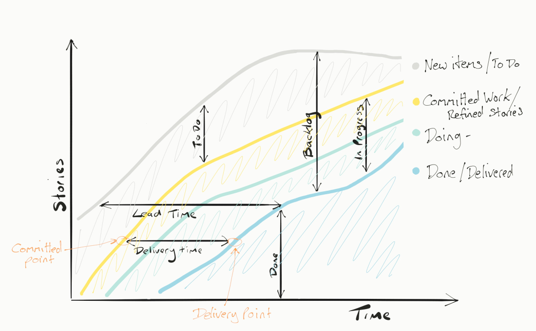
A cumulative flow diagram is very simply a fancy way of showing the status of a TO Do list or in Agile terms: a backlog of work - but is in reality just some very basic information in a pretty graph format.
Take a simple To Do list. I have 10 tasks, they can be “To Do”, “In Progress” or “Done”
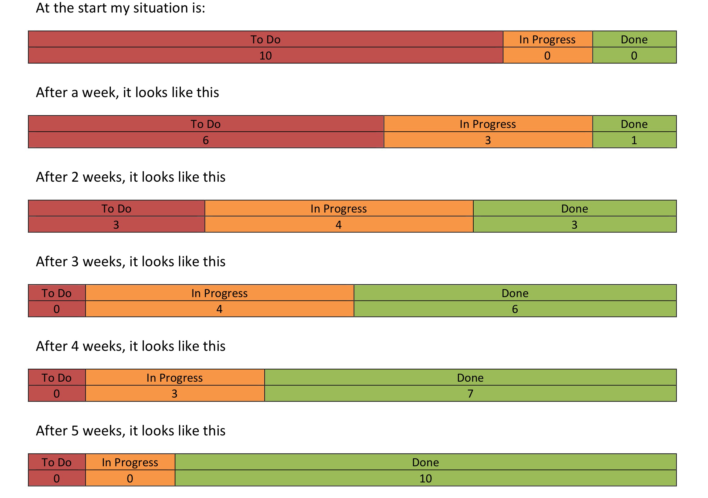
We represent this by turning these blocks 90 degrees clockwise and stacking them: 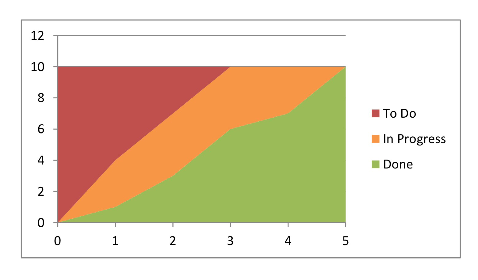
What does it tell you?
Ideally the graph will trend upwards, with the Done section ever increasing until all tasks are complete. The axis show number of items on the y, and time on the x
We are interested in how steep the done section is as this tells us our true progress and our task completion velocity (not to be confused with Story Point Velocity). In theory we should be able to draw a line based on the trend line to predict when the remaining tasks will be done. However…
We are also interested in the rate of increase in the ‘To Do’ section, if we are adding tasks to the list faster than we are completing them the list will never be completed. So we are watching for the ‘To Do’ to level off and eventually stop increasing or at least be slower than the done. Otherwise we will have to draw a metaphoric line in the sand and say this is all we will do. In the previous example we had a fixed task list, but normally we do not.
In Agile projects we often analyse requirements and write stories as we progress – “just in time”, stories are added all the time to cover the next few days or weeks ahead and so you will often see the To Do section rising in line with the Done, but at some point the project has to end and at that point we stop adding stories and will complete. This is likely the most efficient way to get work done but make forecasting difficult. Too much up front planning is likely wasteful.
Finally we come to the most important part of the graph, the “In Progress” section. It is a measure of efficiency of a team how few tasks are in progress at once, lean techniques will sometimes measure the average ‘flow time’ how long tasks are in progress or the ‘Mean cycle time’
Teams should be striving not only to get things done, but to limit the Work In Progress,
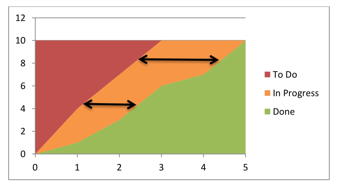
In this graph the team were taking on more tasks, they look busier, but as you can see from the Done section, the slope of the Done is more shallow, ‘Doing’ was as the expense of ‘Done’
If you look at the graph the average time to finish a task at the lower point was around a week, but then by week 4 tasks are taking an average of over 2 weeks, it might be that they are bigger tasks or it might be that they are multi-tasking which is slowing them down. Watch for teams that take on more ‘In Progress’ it is a sign of problems, the team should be consciously aware of how much ‘work in progress’ they have and that it is manageable.
The real world
Graphs like that are rarely seen, most projects have a change of scope and will fluctuate, below is a graph taken from a real team:
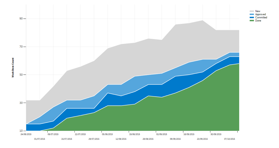
The first comment that needs to be made clear is that this graph shows all items in the To Do list, some are very small tasks, some are huge, the size is not reflected, only the quantity. A small 2 hour spike and a large 20 point story are measured the same.
In this example we have two ‘In Progress’ states, the first is Approved, this means the story has been written, broken down, refined and in some cases estimated by the team and Approved as being suitable to work on. The ‘Committed’ state is work that is currently being worked on by the team.
‘New’ is the To Do list, and as you can see it is steadily increasing, or was until recently and then it took a dip, the dip wasn’t reflected in either the In Progress or Done sections which means there were stories removed, likely they were not relevant to the goal at hand.
You can see from the graph that tasks started to get moved to Done after the first week or so and have steadily increased apart from about 50% of the way through the graph when there was a notable dip in the Done section. Under normal circumstances Done only ever goes up, so this is a cause for interest for someone reading the chart. It is likely that a story was either thought to be Done but wasn’t and was moved back, or the solution was deemed unwanted and removed, either way it deserves comment.
The ‘In Progress’ is fairly consistent, a few times the ‘committed’ is widening and this may warrant exploring why but generally it is pretty steady. The number of items “Approved” is very narrow and may be a reflection of a problem, if there are insufficient stories available for maintaining pace. It is important when doing “just in time” preparation to get the balance right between having enough to sustain pace and too much so that there is waste.
Summary
As you can see the graph, like most graphs doesn’t give all the details. What it does do it prompt the need to ask questions when it deviates from the norm. It is unlikely you can determine the answer to your questions from the graph, further information will generally be necessary, but it can help you form the right questions.
if you are interested in reading a more in depth description of how these diagrams work please ready this Blog